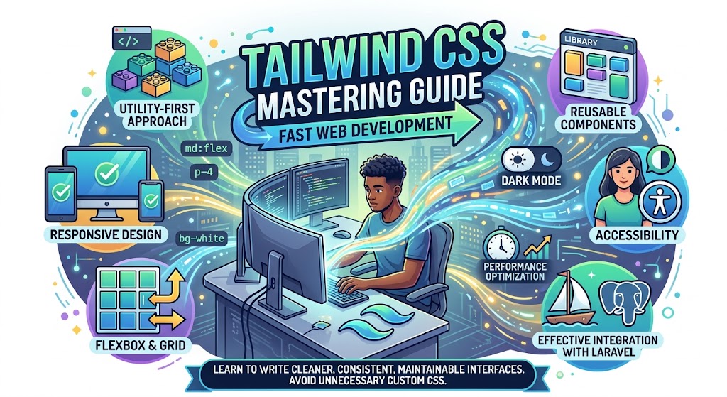
Tailwind CSS makes modern web development faster by providing a powerful utility-first approach to styling. In this guide, discover practical tips and tricks for mastering Tailwind CSS, including responsive design, Flexbox and Grid, reusable components, state variants, dark mode, accessibility, performance optimization, and effective integration with Laravel. Learn how to write cleaner, more consistent, and maintainable interfaces without unnecessary custom CSS.
Mastering Tailwind CSS: Tips and Tricks
Tailwind CSS has changed the way many developers approach modern web design. Instead of writing large custom CSS files and creating separate class names for every component, Tailwind provides a utility-first approach that allows developers to build interfaces directly in their HTML and component files.
Its flexibility, responsive utilities, reusable design system, and extensive customization options make Tailwind CSS a popular choice for modern web applications.
However, simply knowing Tailwind classes is not the same as mastering Tailwind CSS. As projects become larger, developers need to understand how to organize utility classes, create reusable components, optimize production builds, and maintain a consistent design system.
In this guide, we'll explore practical tips and tricks that can help you become more productive with Tailwind CSS.
What Is Tailwind CSS?
Tailwind CSS is a utility-first CSS framework that provides small, reusable utility classes for styling HTML elements.
Instead of writing custom CSS such as:
.card-title {
    font-size: 1.5rem;
    font-weight: 700;
    color: #1f2937;
}
You can write:
<h2 class="text-2xl font-bold text-gray-800">
    Welcome to Our Website
</h2>
Each utility class performs a specific styling task.
For example:
-
text-2xlcontrols font size -
font-boldcontrols font weight -
text-gray-800controls text color -
p-6adds padding -
rounded-lgadds rounded corners -
shadow-mdadds a shadow
This approach makes styling fast and keeps much of the design information close to the markup.
1. Learn the Utility-First Mindset
The first step toward mastering Tailwind is understanding its utility-first philosophy.
Instead of thinking:
"I need to create a CSS class for this card."
Think:
"What combination of utilities describes this card?"
For example:
<div class="rounded-xl bg-white p-6 shadow-lg">
    <h2 class="text-xl font-semibold">Product Title</h2>
    <p class="mt-2 text-gray-600">
        Product description goes here.
    </p>
</div>
The advantage is that the styling is immediately visible where the component is defined.
However, this doesn't mean you should blindly add dozens of classes everywhere. The goal is to use utilities efficiently while creating reusable components where appropriate.
2. Master Responsive Design
One of Tailwind's most useful features is its responsive utility system.
You can apply different styles at different screen sizes.
For example:
<div class="text-sm md:text-base lg:text-lg">
    Responsive text
</div>
This means:
-
Small screens →
text-sm -
Medium screens →
text-base -
Large screens →
text-lg
Tailwind uses a mobile-first approach. The unprefixed utility applies to smaller screens, while responsive prefixes modify the design at larger breakpoints.
Example
<div class="grid grid-cols-1 gap-6 md:grid-cols-2 lg:grid-cols-3">
    ...
</div>
This creates:
-
One column on mobile
-
Two columns on medium screens
-
Three columns on large screens
Tip
Design for mobile first instead of creating a desktop layout and trying to fix it later.
3. Use Flexbox and Grid Effectively
Tailwind makes modern CSS layout systems extremely easy to use.
Flexbox
<div class="flex items-center justify-between">
    <h2>Dashboard</h2>
    <button>Settings</button>
</div>
Common utilities include:
-
flex -
flex-col -
items-center -
justify-center -
justify-between -
gap-4 -
flex-wrap
CSS Grid
<div class="grid grid-cols-3 gap-6">
    <div>Card 1</div>
    <div>Card 2</div>
    <div>Card 3</div>
</div>
Grid is especially useful for dashboards, product listings, galleries, and card layouts.
4. Use the Spacing System Consistently
Tailwind provides a spacing scale that can be used for:
-
Margin
-
Padding
-
Gap
-
Width
-
Height
-
Positioning
For example:
<div class="p-4">
    <div class="mb-6">
        Content
    </div>
</div>
Instead of randomly choosing values, use Tailwind's spacing scale consistently.
This creates visual consistency throughout your application.
5. Use gap Instead of Excessive Margins
A common mistake is adding margins to every child element.
For example:
<div class="flex">
    <div class="mr-4">One</div>
    <div class="mr-4">Two</div>
    <div>Three</div>
</div>
A cleaner approach is:
<div class="flex gap-4">
    <div>One</div>
    <div>Two</div>
    <div>Three</div>
</div>
Using gap makes layouts easier to maintain and prevents special-case spacing on the final element.
6. Use space-* for Simple Stacked Layouts
For vertically stacked content, Tailwind's space-y-* utilities can be useful.
<div class="space-y-4">
    <div>First item</div>
    <div>Second item</div>
    <div>Third item</div>
</div>
This is particularly useful for:
-
Forms
-
Lists
-
Navigation menus
-
Settings pages
-
Text sections
7. Use State Variants for Interactive Interfaces
Tailwind makes it easy to style interactive states.
Hover
<button class="bg-blue-600 hover:bg-blue-700">
    Save
</button>
Focus
<input class="border focus:border-blue-500 focus:ring-2">
Disabled
<button class="bg-blue-600 disabled:opacity-50">
    Submit
</button>
You can also work with states such as:
-
active: -
visited: -
checked: -
required: -
invalid: -
focus-within:
These variants make it possible to create polished interfaces without writing separate CSS rules.
8. Use group for Parent-Child Interactions
Sometimes you want a child element to change when its parent is hovered.
Tailwind's group utility makes this simple.
<div class="group">
    <h3 class="text-gray-800 group-hover:text-blue-600">
        Product Name
    </h3>
</div>
When the parent is hovered, the heading changes color.
This is useful for:
-
Cards
-
Navigation menus
-
Image overlays
-
Interactive lists
-
Product previews
9. Use peer for Form Interactions
The peer utility allows one element to respond to the state of a sibling.
For example:
<input id="email" class="peer" type="email">

<label
    for="email"
    class="text-gray-500 peer-focus:text-blue-600">
    Email Address
</label>
This can be useful for:
-
Floating labels
-
Validation messages
-
Interactive forms
-
Toggle controls
10. Don't Be Afraid of Arbitrary Values
Sometimes the standard Tailwind scale doesn't provide exactly what you need.
Tailwind allows arbitrary values.
<div class="w-[437px]">
    ...
</div>
You can also use custom colors and other CSS values:
<div class="bg-[#123456]">
    ...
</div>
Arbitrary values are useful when you have a legitimate design requirement.
However, don't use them everywhere.
If you repeatedly use the same custom value, it may be better to add it to your design system or configuration.
11. Create Reusable Components
One criticism of utility-first CSS is that HTML can become crowded with classes.
For example:
<button class="rounded-lg bg-blue-600 px-5 py-2.5 font-medium text-white hover:bg-blue-700">
    Save
</button>
If the same combination appears dozens of times, don't repeatedly copy it.
Instead, create a reusable component.
In Laravel Blade, for example:
<x-button>
    Save
</x-button>
The component can contain the common Tailwind classes.
This gives you the best of both worlds:
Utility-first styling + reusable components.
12. Use @apply Carefully
Tailwind's @apply directive allows utilities to be combined inside CSS.
For example:
.btn-primary {
    @apply rounded-lg bg-blue-600 px-5 py-2.5 font-medium text-white;
}
Then:
<button class="btn-primary">
    Save
</button>
This can be useful for highly repeated styles.
However, don't turn every utility combination into a custom CSS class. Doing that can recreate the complexity that utility-first CSS was designed to reduce.
Use @apply selectively.
13. Build a Consistent Design System
Large projects benefit from consistent design decisions.
Instead of allowing every developer to choose random:
-
Colors
-
Font sizes
-
Border radii
-
Shadows
-
Spacing values
define a common design language.
For example, decide that:
-
Primary actions use one color.
-
Cards use a consistent radius.
-
Headings follow a predictable type scale.
-
Spacing follows the same system.
This makes the application feel professionally designed.
14. Use Semantic HTML
Tailwind controls appearance, but it doesn't replace good HTML structure.
Instead of:
<div class="cursor-pointer">
    Submit
</div>
use:
<button type="submit">
    Submit
</button>
Then style it:
<button
    type="submit"
    class="rounded-lg bg-blue-600 px-4 py-2 text-white">
    Submit
</button>
Semantic HTML improves:
-
Accessibility
-
Keyboard navigation
-
Maintainability
-
SEO
-
User experience
15. Think About Accessibility
A beautiful interface is not necessarily an accessible interface.
Make sure your Tailwind designs provide:
-
Sufficient color contrast
-
Visible focus states
-
Appropriate button sizes
-
Proper labels
-
Keyboard accessibility
-
Meaningful HTML structure
For example:
<button
    class="rounded-lg bg-blue-600 px-4 py-2 text-white
           focus:outline-none focus:ring-2 focus:ring-blue-500">
    Save Changes
</button>
Never remove focus indicators simply because they don't match the visual design.
16. Use Dark Mode Effectively
Tailwind provides utilities for building dark-mode interfaces.
For example:
<div class="bg-white text-gray-900 dark:bg-gray-900 dark:text-white">
    Dark mode content
</div>
You can progressively design components for both themes.
A useful approach is to define your colors consistently rather than adding dark-mode overrides randomly throughout the application.
17. Keep Class Lists Readable
Long class lists can become difficult to understand.
Instead of putting everything into one extremely long line, format complex markup clearly.
For example:
<button
    class="
        rounded-lg
        bg-blue-600
        px-5 py-2.5
        font-medium
        text-white
        hover:bg-blue-700
        focus:ring-2
    "
>
    Save
</button>
The exact formatting style depends on your project, but consistency is more important than the particular style you choose.
18. Use Tailwind with Laravel Efficiently
Tailwind works particularly well with Laravel applications.
A typical Laravel project can use Tailwind alongside:
-
Blade
-
Livewire
-
Alpine.js
-
Vue
-
React
For example, a reusable Blade component can combine application logic with a consistent Tailwind design.
<x-card>
    <x-slot:title>
        Student Information
    </x-slot:title>

    <p class="text-gray-600">
        View student details and academic information.
    </p>
</x-card>
This approach is particularly useful for large Laravel applications where many pages share common interface elements.
19. Keep Performance in Mind
A production application should not ship unnecessary CSS.
Tailwind's build process is designed to generate the styles your project actually uses.
You should still ensure that:
-
Production builds are optimized.
-
Unused dependencies are removed.
-
Large images are optimized.
-
JavaScript is minimized where appropriate.
-
Components are structured efficiently.
For large applications, performance should be considered from the beginning rather than treated as a final step.
20. Avoid Overusing Tailwind
Tailwind is powerful, but more classes do not automatically mean better code.
Avoid situations where:
-
The same huge class list is copied repeatedly.
-
Arbitrary values are used everywhere.
-
Components become difficult to understand.
-
Design decisions are inconsistent.
-
Utility classes are used instead of semantic HTML.
The goal is not to use as many Tailwind classes as possible.
The goal is to create clean, consistent, reusable, and maintainable interfaces.
A Practical Tailwind Workflow
A good workflow for a new project could look like this:
Step 1: Define the Design
Decide on:
-
Colors
-
Typography
-
Spacing
-
Border radius
-
Shadows
-
Breakpoints
Step 2: Build the Layout
Use:
-
Flexbox
-
Grid
-
Container utilities
-
Responsive variants
Step 3: Build Reusable Components
Create components such as:
-
Buttons
-
Cards
-
Forms
-
Modals
-
Navigation
-
Alerts
Step 4: Add Interaction States
Implement:
-
Hover
-
Focus
-
Active
-
Disabled
-
Loading
Step 5: Test Responsiveness
Check your interface on:
-
Mobile phones
-
Tablets
-
Laptops
-
Large monitors
Step 6: Check Accessibility
Verify keyboard navigation, focus states, labels, contrast, and semantic HTML.
Step 7: Optimize for Production
Build the production assets and test the final application under realistic conditions.
Final Thoughts
Mastering Tailwind CSS isn't about memorizing hundreds of utility classes. It's about understanding how those utilities can be combined to create consistent, responsive, accessible, and maintainable interfaces.
Start by mastering the fundamentals of layout, spacing, typography, responsive design, and state variants. Then move toward reusable components, design systems, accessibility, and performance optimization.
For Laravel developers, Tailwind CSS can be especially powerful when combined with Blade components, Livewire, Alpine.js, or modern frontend frameworks.
The most effective Tailwind developers don't simply write more classes—they make better design and architecture decisions.
Use Tailwind to build a system, not just a page.